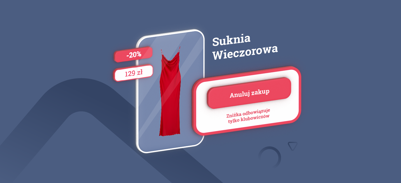

Imagine you need to choose a creation for the evening. You go shopping and head to a place where you think you will find something for yourself. A signboard welcomes you from the doorstep, encouraging you to take advantage of the available promotion. So, with interest, you go to the sales department. On the spot, however, it turns out that you can find only clothes mess. You know it’s gonna be hard to find anything here. After a long period of searching, you try on a specific thing and head to the cash register. There, it turns out that the promotion applies only to club members and if you want to make a purchase after a discount, you must first make a registration. So you abandon the purchase because you don’t want to provide your data, which will be processed in the future.
The example above is nothing more than abandoning the shopping path, which we also observe on the online store.
It happens that we abandon our basket before we even go to the checkout. According to the Baymard Institute, based on 48 different studies containing statistics on e-commerce cart abandonment, the average rate for this phenomenon was 69.99%. According to this result, it can be assumed, that practically seven out of ten customers, will never complete the purchase.
From the article you will learn:
- How to distinguish the abandonment of the cart from the abandonment of the checkout;
- Why clients abandon the shopping cart and the purchasing process;
- How to increase the number of successful transactions;
Abandoning the cart vs. abandoning the checkout
Many people use the term “abandoning the cart”, considering it as leaving the store at the stage of finalizing the purchase. First of all, there must be at least one product in the cart to abandon it. On the other hand, at the time of placing an order, we are at the next stage. That’s why we are abandoning the checkout.
The difference between abandoning the cart and abandoning the checkout is significant, due to the buying intent. At the time we add products to the shopping cart, our decision to leave the website is associated with uncertainty. We don’t know if the product will really meet our needs.
The product card may raise the first doubts. However, for e-commerce, the most important thing will be the loss of a potential customer during the purchase process. This is probably due to errors that prevent smooth shopping.
For today’s consumer, convenience matters. Online stores should therefore be adapted for easy and fast operation. It is important to keep this in mind when developing a UX strategy.
You can calculate the rate of abandoned carts and the rate of abandoned checkouts yourself and see if this problem applies to you.
Paterns (rate of abandoned carts and the rate of abandoned checkouts)


Why do we abandon the shopping cart and the checkout?
Lack of trust in the website
The website of the online store shouldn’t only correspond to the user needs, but also build the trust. Remember: SSL certificate isn’t enough. Outdated layout undermines brand credibility and “effectively” scares buyers away. So it is worth investing in refreshing the appearance of the website.
Unordered content on the page
It’s said that the most important thing is the first impression.
The online store should encourage the customer from the beginning. Chaotic content on the product card increases the probability of abandoning the cart. The lack of intuitive website’s usability affects the negative user perception. A common mistake is also the lack of information about adding the product to the cart. Constant distractions in the form of pop-up notifications interfere with browsing the offer. They cause the customer to get discouraged, leave the store and. . . never come back. A potential opportunity to reap benefits turns into mistakes that cost the loss of another customer.
Lack of early information on delivery capabilities and costs
Before placing an order, the user should read the terms and conditions of purchase. These include issues related to the form of payment and delivery.
In the Baymard Institute report, when asked about the main reason for abandoning an order in the last three months, as many as 48% of respondents reported additional charges, including delivery costs. In turn, 22% of surveyed indicated that the waiting time for the shipment was too long.
Delivery information should be visible on the product card. What interests the client is the delivery date and the costs associated with it. If the waiting time is longer than the standard, the store should inform the customer about it.
Unexpected, additional costs
Although it may seem so, unexpected costs are not only related to delivery. If the store offers a paid service, that should be marked on the product card. For example, a T-shirt with a personalized print or a pen with engraving should be presented with a price including additional costs. A store that shows these costs only in the order summary, risks abandoning the cart.
Purchases only if a client have an account
The user adds products to the cart, goes to the summary and. . . unexpectedly receives information that it is obligatory to create an account. It won’t be possible to complete the purchase without it.
Eventhough it’s hard to believe, you can still see such cases. According to the Baymard Institute research, 24% of respondents confessed to abandoning their shopping cart when the forced registration window pops up. Conclusion? Forcing registration may not bring the expected results.
Complicated ordering process
At the stage of placing an order, the customer is already sure of its choice. However, decide to abandon the checkout eventually. Why? This idea is quite supported by too long form with a great number of fields to fill in. The study conducted by Baymard Institute shows, that 17% of users abandon their shopping cart due to a problematic ordering process. It doesn’t sound optimistic, given the competitive e-commerce market.
In addition, the decision to leave the website may be caused by stock shortages. Especially if the user added the product to the shopping cart and there was no indication that it might not be there in a moment. Doubts may also arise about the return policy, which isn’t conducive to convenient product return.
The payment method plays a big role. In the age of mobile payments, users rarely decide to make a traditional transfer. Reluctance to plug in card details often ends in abandoning the cash register. Online store with a limited selection of payments, closes to the customer.
What can I do to increase the number of successful trades?
Every e-commerce can be improved. Here are some rules to avoid the basic UX mistakes in online stores:
- Build trust – this will be provided by a professional platform, by which you will increase sales conversion;
- Implement multiple payment methods – including deferred payments, which are gaining growing popularity;
- Simplify the order process – limit the number of fields to fill in, pay attention to how it looks on the mobile version;
- Reduce chaos on the site – avoid excessive notifications and ensure intuitive use of the platform. It is worthwhile to regularly examine the paths in the store and the platforms on which they operate;
- Introduce a clear return policy – set a minimum of 30 days to make a return;
- Share the opportunity to purchase without registration – Let the customer be “only” your guest;
- Include as much information as possible on the product card – let the user know about low stock; don’t avoid giving delivery and additional costs;
- Update page layout – preferably under the supervision of specialists;
- Remind yourself – use remarketing by paid advertising campaigns;
Do you want to check if your e-shop works well? contact us!? Our specialists will advise you what you can do to take care of your customer’s shopping experience even better!


