


Adapting to international e-commerce trends, the Polish m-commerce market is developing more and more dynamically. The percentage of Polish internet users shopping online is increasing and currently stands at 79%. On domestic e-commerce platforms, 75% of users become customers, while on foreign platforms – 30%. These data come from the sources of the organization “Polskie Badania Internetu” and the Association of Internet Industry Employers IAB Poland, included in the “E-commerce in Poland 2023” report.
The move to the digital world is now the norm, which is why so many companies follow their customers where they are – online.
Given this, the key becomes:
- developing an intuitive purchasing process on mobile devices;
- adapting the functionality on the listing and product page to the
- specifics of the purchase path on mobile;
- effective presentation of the product in the shop;
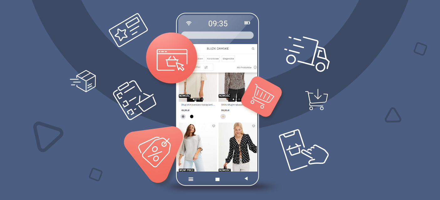
Notably, users browse products and make purchases on mobile devices. Therefore, this article will discuss the basic principles of a successful shopping process, which will help reduce shopping cart abandonment and increase m-commerce sales.
Best practices for navigation on mobile devices
Simple and intuitive navigation
Users do not want to have to think about what buttons are for, where links lead, or what icons mean. From the point of view of the usability of the mobile version of the shop, it is important that the navigation is intuitive for the target users. This means that it is worth doing some research to understand the mindset of the potential customer.
In this case, the best solution is to use methods such as: “card sorting” (card sorting) and “tree testing” (tree testing).
Card sorting is a research method in which participants group topics in a way that is logical to them. Typically, UX professionals perform card sorting by placing topics on separate cards, asking users to group related issues, and giving each group a name (or assigning a category). This technique helps to understand the user’s thought process about how a feature works or what to expect. Using this research method allows researchers and UX designers to create an information architecture that is more intuitive for the user and easier to navigate.
After card sorting, tree testing is the next step of presenting an established navigation and checking how easily users can use it. This testing involves preparing a diagram of the data structure, which is shaped like a tree, where the main page is the root and the subsequent branches are the developing hierarchical structures. Users are then expected to perform specific tasks, such as finding a particular piece of information or reaching a specific page. During the test, it is monitored which paths users take, how long it takes them, and which errors they make.
Well-designed icons
Correctly selected and designed icons effectively communicate the results of specific actions, increasing the interface’s readability and making it more visually appealing.
Which icons will work best? Those that are easily recognizable and familiar to users. Use tried-and-tested, universal templates. If possible, caption icons should be used to improve legibility and eliminate potential interpretation problems.
Let’s also avoid ambiguous or mutually exclusive icons, i.e. icons that can be interpreted in several ways by the user or that can have different meanings depending on the context of the application in which they are used. Let’s be guided by the principle that the less ambiguity, the faster the user will achieve its goals. Pay attention to the order and co-occurrence of icons that may affect each other. The same icon may be individually interpreted differently than in the context of a group.
Explicit content and hierarchy of elements
Mobile screens are much smaller than desktop versions, which challenges the readability of the content displayed. Hence, navigation in most applications is mainly based on text using icons.
Baymard Institute research shows that for mobile users, the best option is to reach the main product categories via the navigation menu, where each category is visible by default. It is, therefore worth shortening the path to the product categories.
It is therefore worth shortening the path to the product categories and abandoning the division, which assumes that the mobile user first sees the shop’s main category and then the subcategories with products such as dresses, blouses, etc.
By presenting the product categories as top-level elements in the menu, users can start browsing products as soon as they open the main navigation. In addition, users unfamiliar with the site can quickly see what types of products are offered – allowing them to explore the product catalogue quickly.
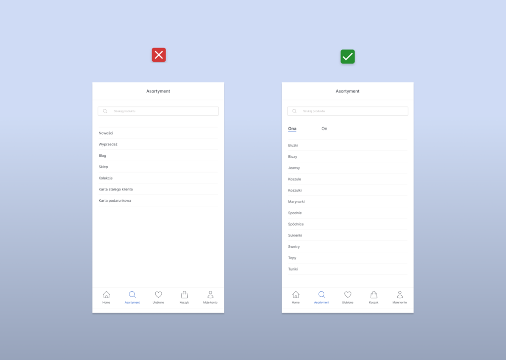
of the e-shop”.
How do I improve my product page (listing)?
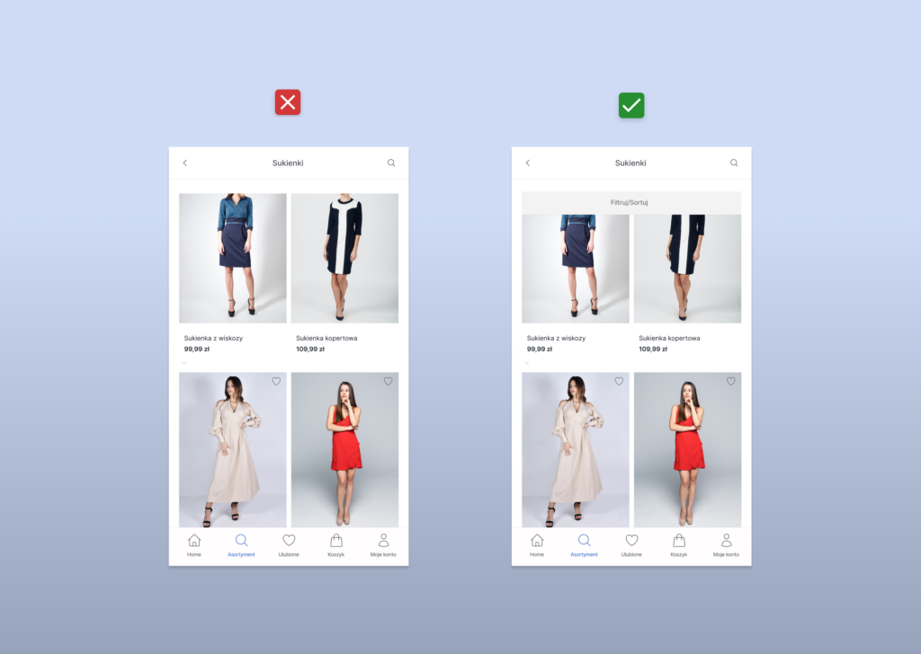
Filtering and sorting visible to the user
It will come as no surprise that shoppers who browse an online shop’s pages on a mobile device have to do much more scrolling than on the desktop version. It is, therefore, sometimes the case that such essential elements as filtering/sorting options can disappear
from view. To always have them at hand and not force users to constantly “scroll up and down”, it is worth using the so-called “ticky bars” option, which assumes that filters
and sorting remain “glued” to the top of the screen while the user scrolls the page. In this way, she can always change her preferences quickly and thus find the right product more quickly.
The filters should be arranged according to popularity – the most frequently used filter attributes should be available to users first.
For each selected option, let us provide the possibility to remove individual filters and all selected options with a single button, for example, “Remove filters”. This way, users will not have to search for the chosen options in different sections, enabling them to act more quickly.
Matching photos
The images should be large enough and detailed enough for users to see the product in detail. However, they only need to show some details from the listing level, as the user can get more information on the product page. As Nielsen Norman Group points out, from the listing level it is useful to present the product in such a way that it is clear how it differs from another.
Providing several images of each product in the listing gives users additional information to help them decide whether to click on the product and find out more. Different shots of the images, which include, for example, the product itself, the product on a model, or the appearance of the product from the front and back, can be helpful in the decision-making process.
Showing products in the context in which they will be used, e.g. furniture in a room, toys next to a child, or a bracelet on a hand, is also a key element in letting the user know whether the product meets its expectations.
“Add to Cart” button
Let’s start with when it’s not worth putting an ‘Add to Cart’ button on a product list.
Firstly, if the products are described in detail and usually require thorough research before purchase, it is better to direct users to the product page, where they can read all the details before making a purchase decision.
Secondly, where customers usually buy single items instead of several at once and prefer to find out more about the product, especially if unique, expensive products are offered on the site. Then there is no need to include an ‘Add to basket’ button in the listing.
I suggest including an ‘Add to basket’ button in the product list if customers are familiar with the products they intend to purchase or often purchase them in sets or packs and, therefore, do not need additional, detailed information before adding them to the basket.
Read more: UX mistakes that cost you loss of the customers
What should be included on a product page to increase sales?
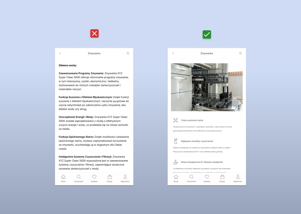
Information conveyed through visual language
E-commerce platforms confirm that a picture says more than a thousand words. Without physically touching the product, users rely on visuals to understand what the product is like. Additionally, images are quickly perceived and processed by the brain, making them a key element in capturing users’ attention.
Therefore, it is helpful to use approaches that are repeated in the listing:
- present a set of photos to show the product from different perspectives and angles;
- introduce a zoom function, allowing users to look at the texture and fine details of a product;
- combine photos of a product with images of it on a model or in an appropriate environment, which helps to give a better understanding of the product’s appearance and size.
Beyond this, approaches to photographic content can vary depending on the overall brand strategy and the nature of the campaign or collection. Nevertheless, there are a few common features: high-quality images, originality, and SEO optimization.
In addition to traditional images, many other forms of visual messages can be used in e-commerce. These include: product videos, video reviews and video instructions, 360-degree views of products, augmented reality that will allow users to, for example, view products in their own environment or try them on virtually.
Informative description
The joint statement that people have stopped reading does not apply to product pages. When making a purchase decision, customers carefully read the information about the product they intend to buy. Nevertheless, the description should be manageable, as the customer’s attention is limited. The text should be short, simple, specific and adapted to the recipient. It should answer the basic questions: what is the product? What does it look like? What and how does it do? This information must appear right from the start, when the customer is most likely to read it, rather than filling the space with standard marketing slogans that customers are already tired of.
Another practical rule that links to the previous point is: show, don’t tell.
However, it’s better to tell and show! We don’t just describe how a scarf pairs perfectly with the jacket – we show it in the picture. We don’t just focus on the toy’s dimensions – we show how the child plays with it.
Placement of CTAs
It is best to place the CTA as a pinned button at the bottom of the page, which ensures the continuous visibility of the most relevant element on the product page. In the context of limited space on mobile devices, the CTA button should be of an appropriate size for comfortable touching without the risk of unintended clicks.
How do you design the process of making a purchase?
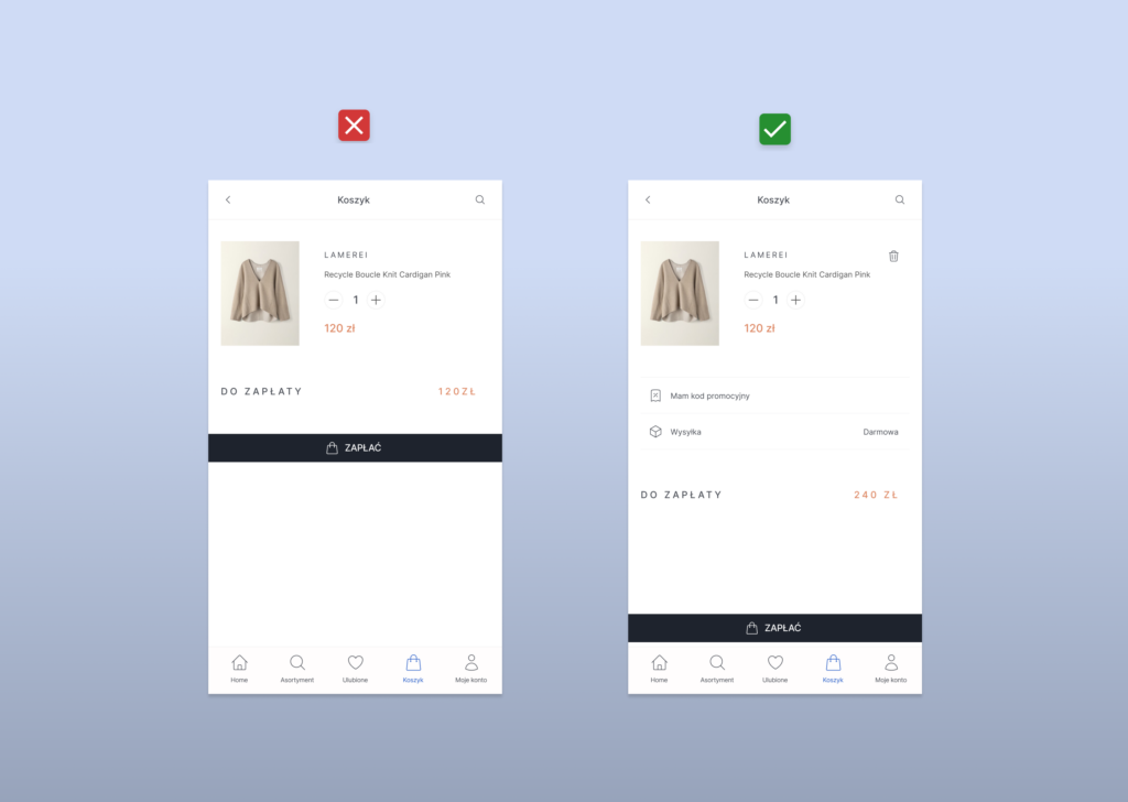
Easy modification of basket contents
Ensure clarity of product, price and shipping information. The name, image, colour, quantity and size of the product should be clearly visible in the shopping cart. Ease of changing these details from the shopping cart is key. The users should know what is in the basket and the final cost, including shipping and taxes, not expect any hidden charges that might discourage them from making a purchase.
Everyone makes mistakes sometimes. Users may change their minds or add the wrong products to the basket. However, the transaction process must be smooth for potential customers. Therefore, simplifying the mobile payment interface is worth simplifying for easy changes. Users should see a clear ‘Delete’ button next to each product in the shopping cart. Important: Do not force the customer to change the ‘Quantity’ field to zero to remove a product from the basket! This additional, unnecessary action can upset and hinder the customer’s purchasing process.
Purchases without registration
The creation of accounts by users benefits the company by collecting email addresses for marketing purposes and the capture of personal data for better customer profiling. However, the requirement to register an account before a purchase can discourage transactions and lead to the opposite effect. In addition, being forced to create an account results in almost 1/4 of customers abandoning purchases. Therefore, a better solution is to offer the possibility of making a purchase as a guest at the checkout.
For some online shops, users can choose between paying as a guest and logging in or registering. On the one hand, the benefits of creating an account are clearly presented, such as faster order processing, the ability to save multiple delivery addresses and easy access to order history and status. On the other hand, customers who are not interested can still skip this step, which shortens the process and potentially increases the number of completed orders by eliminating unnecessary steps.
A limited number of fields in the form
It is worth simplifying forms by eliminating unnecessary fields such as title, middle name, and merging first and last name into one field. If possible, aim to limit the number of form fields to a maximum of 6-8. Mark each required field with an asterisk.
Place labels over form fields. Research shows that labels above fields are easier and quicker to scan.
Even small changes, such as automatic postcode recognition, guidance on how to fill in the fields, and auto-fill, can improve conversion rates.
Also, remember to automatically take the user to the next field he or she is asked to fill in. This will make it quicker to enter all the data and ensure that the whole process of completing the purchase is correct.
Read more: Forgotten homepage: What mistakes are most often made by e-shop owners
In conclusion
What sets mobile design apart is the special attention to detail. User interface components, optimized for mobile devices, make it easier to navigate a website or app quickly and smoothly. If you are an e-commerce owner wondering how to optimize your m-commerce, I have an essential piece of advice for you: always remember that you are creating for people. Take the customer’s perspective and try to understand their needs. I hope that the tips I have mentioned in this article for designing e-commerce for mobile devices will help you to create an exceptional experience for the mobile users of your e-store.
Check your e-shop, by choosing UX audit.
Lidia Aksiuk
UX Designer


