


Before I get to the main topic, I’d like to dedicate the first paragraph to explaining why I will focus on the homepage.
We can all agree that users want to shop online quickly and easily. If they have trouble finding what they’re looking for, they’ll try to find it in another store.
This, in turn, will translate into a lack of conversion, which is responsible for online store errors. The only question is, where do we find them?
Having been in the industry for ten years, attending various conferences, and browsing the internet all over, I often come across headlines:
- how to optimize the shopping path;
- how the ideal page of a product or category should look;
- how to optimize the payment process;
The site’s listed elements are so popular for a straightforward reason. They are associated with improving the most critical e-commerce factor, i.e., conversion rate.
Of course, I do not dispute the importance of an optimized shopping path, payment process, product page, or category. However, I pay attention to an element of the store’s website that is often overlooked in a comprehensive discussion: the home page.
Why should you look at errors on the homepage?
Users’ shopping habits have changed in recent years to the detriment of the homepage. We often enter the product page from, for example, Google purchases or store accounts on social media.
So, does the homepage lose importance? Not at all.
My UX team’s analysis shows that more and more respondents pay attention to the content and functioning of the homepage. This is especially true when you are on a website for the first time and trying to build trust in the service/brand. Unfortunately, various errors can cause users to leave a given site even before familiarizing themselves with its offer.
Let’s compare the home page of the online store to the site of the brick-and-mortar store. When shopping in brick-and-mortar stores, e.g., in a shopping mall, we expect shop windows to showcase such a place. Potential customers may be encouraged to purchase in a particular store before entering it. We have visible information about current promotions, often showing examples of creations and their price. Everything is presented in a very accessible, modern, and organized way.
The home page of websites should play a similar role in encouraging customers to shop. Unfortunately, from my experience, this is relatively rare.
Below, I will tell you what elements we should consider when designing a website (every website, not just the main one) and what errors I often encounter during my work.
I divided the errors into three main categories, which, in my opinion, often result from the ignorance of those responsible for e-shops:
- Cognitive overload affects each of us and our ability to interact with the environment.
- Poor information architecture prevents users from quickly getting the information they seek.
- Failure to consider the context of use also leads our users to problems when using the Service.
The fourth category, which I will not discuss in more detail, is test errors, which result from simple neglect of websites by their owners, e.g., non-clickable elements, erroneous translations, and non-functional elements/functionality of online stores.
Cognitive Overload
According to the global report “Digital 2023” in Poland, users are estimated to spend 6 hours and 42 minutes online (5 minutes more than the result for the whole globe). [1] The use of different sizes of elements or the choice of colours affects our perception. How the information is provided may mean that we need help finding some of the content on the site.
Therefore, it is essential to help our users get acquainted with our site. Sometimes, it is worth taking inspiration from other websites’ solutions—especially if they are industry leaders —rather than trying to create trends in our way. Remember that from the point of view of potential customers, all services should work similarly and be familiar to them. Thanks to this, they will not have to learn how a new service works that they did not use before.
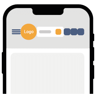
A common mistake when designing the homepage is overloading the navigation bar with information. This can cause fatigue, impatience and reluctance to stay on the site.
Another factor that makes it difficult for users to use the overloaded navigation bar is the difficulty of precisely clicking on individual elements. This often results in the accidental selection of the wrong option. The problem is more significant the smaller the device users use. (Figure 1)
Also read: UX mistakes that cost you loss of the customers.
Information Architecture
Information architecture is fundamental in any website but is often treated carelessly. The list of mistakes website owners make in this area is very long, and the area itself is so extensive that you could devote an entire article instead of a paragraph to it. However, when researching different services in the Polish market, I see the need to touch on some of the most essential elements here.
First of all, there is no need for advanced research methods to analyze and optimize information architecture. Google Analytics will be beneficial here. By applying this tool, you can check what attracts the most attention on the homepage. Tag menu items and GA will collect information about how often they are clicked. Information obtained from the internal search engine also plays an important role. Thanks to them, you know which phrases are typed most often. It is worth ensuring that the search engine returns the products our users are looking for and that it is easy to access them from the menu. Thanks to the data from GA, you can also check which filter options are selected most often. This information can improve the usability of the menu. Additional activities are “card sorting” and “tree testing”.
The most common errors that we notice when testing services within the information architecture are:
- non-intuitive division of categories;
- nomenclature incomprehensible to users;
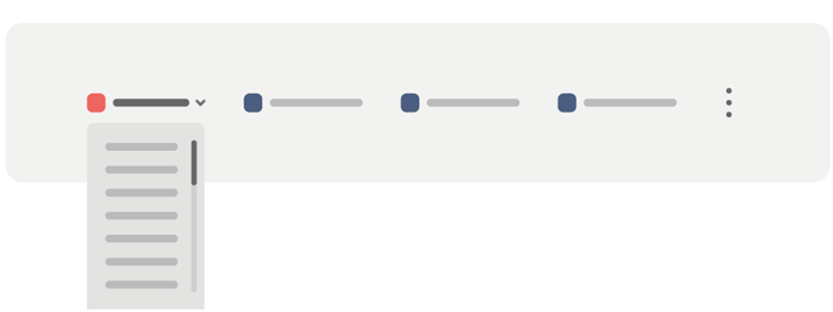
- too long lists, which do not fit on one screen, which causes users to “scroll” individual bookmarks (Figure 2)
- lack of confirmation in which part of the system the user is located;
- duplicate bookmarks that, despite different names, refer to the same page;
- unreadable menu, i.e., pressed bookmarks (read merging text) or poor contrast between text and background (significant for users with poor eyesight).
Also read: What is A/B Testing and why should you do them?
Context of use
This is my favourite category because I get the most exciting reactions when discussing these mistakes with our clients. Unfortunately, effectively concluding in this area is much more complicated than in previous categories. This is because, from the analytical tools alone, it can be challenging to understand why this and the different behaviour of online store visitors results.
We always receive the most interesting requests from a given client’s target users and investigate how they use the Service. Why? I will try to prove this by sharing two examples:
1. Adding a product to “favourites” from the category level: This is an element of the site that I would like to draw attention to, above all, stores whose users are mothers raising small children at home. During our research, we discovered that these users have a few moments each day to browse as many products as possible while shopping. Those that they like, they add to their favourites. When toddlers sleep well, moms can browse the products in the so-called clipboard and finally choose the ones they will buy.
Given this context, it should be remembered that the functionality of adding to favourites should be:
- easily accessible from the category level;
- intuitive (remember to inform users what happens when they click on the heart icon and confirm the status of the system at every step);
- with no registration required (often, users will not have time for it during the day);
- not erased after a short time (it is not known when users will have time to complete purchases);
- Accessible to add “favourites” to the clipboard from any side of the site, preferably where users expect it, i. e., in the upper right corner next to the cart icon;
2. Contrast in the website and placement of individual elements: I mentioned this when discussing information architecture, but I would like to expand on this point further. During our research, we regularly meet people who complain, for example, about services they cannot use in various life situations, e.g., during the train ride to work (e.g., several hours a day). Too small the distance between the individual elements may cause users to be unable to select the desired options precisely under challenging conditions (shaking means of transport). Poor contrast also prevents shopping, e.g., outdoors, where the sun can cause poor visibility on mobile devices.
I mentioned that it is difficult to draw conclusions considering the context of using analytical tools alone. However, this does not mean it is not worth looking for tips in GA. For example, it is worth analyzing the traffic sources from which our users visit the site and the first and subsequent pages they visit. Then, try to put yourself in the user’s position and go through the same paths. This allows us to ensure that all the necessary elements and functionalities are in place. By analyzing only some screens individually, we will not be sure that the whole process, which is crucial for us, is intuitive for potential customers.
After analyzing the data, I remember a client who turned out that the primary CTA on the first page was the “Leave a review” button. Users received this message before they could see the offer, let alone make a purchase.
Summary
In summary, I want to address all the people reading this article responsible for e-commerce sites.
Remember that your services should not be created with you in mind. They should not be helpful to you or your graphic designers or programmers who create certain Service elements on large monitors in a suitably lit room.
Online stores should be convenient for users who use them at different times of the day and in strange situations. If you want to find out how your Service is perceived by its users, it’s best to ask them.
The more convenient the services you create, the less often my mom calls me and asks me to make purchases on her behalf. Sometimes, it could be more apparent in her payment process, and sometimes, the previously mentioned too little contrast causes some buttons not to be seen on her phone. Whatever it is, I hope that my mother will have such problems much less in the future, which I wish myself and you with all my heart.
Tomasz Zarychta
Web Analysis Team Manager


